It always feels rewarding when you give somebody your business...
Read More


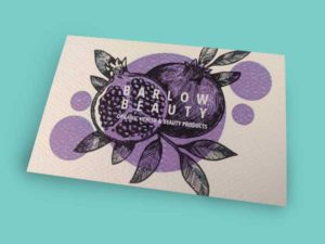
Inspiration for Business Card Designs
Inspiration for your Business Card Designs I don’t know what...
Read More